Flexbox in CSS and WordPress
Topic Description
A basic understanding of CSS Flexbox is needed to understand how WordPress row and stack blocks work. This lesson plan covers both the HTML/CSS context and the equivalent Site Editor functionality since the site editor uses Flexbox under the hood.
Related Resources
Since this lesson is about CSS technology, I’m also including external links.
Description
To fully understand how Row and Column blocks work in the full site editor, you need some basic understanding of how CSS Flexbox works. In this lesson, we’ll cover the basics of Flexbox and how it applies to the row and column blocks.
Objectives
After completing this lesson, participants will be able to:
- Explain the basic concepts of flexbox
- Describe how the row and column blocks in WordPress use Flexbox under the hood
- Create column and row layouts in the full site editor
Prerequisite Skills
Participants will get the most from this lesson if they have familiarity with:
- Basic experience using Git or Github
- Flexbox CSS syntax
- Working in a text/code editor
- Editing themes in the full site editor
- Completed the Basic WordPress Concepts lesson
Readiness Questions
- Do you want to create column- or row-based layouts in WordPress?
- Have you written CSS stylesheets?
- Have you worked with a text/code editor like VS Code, Atom, WebStorm, Sublime Text, Atom, or any other?
- Have you created themes with the Full Site Editor?
Slides
Not available
Materials Needed
- A good code editor. Possible options
- A local WordPress installation
- A working block theme (Twentytwentytwo is recommended)
- Data to populate the theme with (Theme unit test data is recommended)
Notes for the Presenter
- The first part of the lesson is about CSS Flexbox, how it works and how you get column and row layouts
- The second part explains how WordPress uses Flexbox under the hood when using the row and column blocks.
Lesson Outline
- Introduction: What is Flexbox?
- How does it work?
- Example
- Column Layout
- Row Layout
- Exercises
- How does it work in the full site editor?
- Column and Row Blocks are variations of the group block
- They use Flexbox under the hood
- Examples
- Row block
- Exercises
- Row layout
- Review
- Participant questions
Exercises
The exercise files are in the course repo. https://github.com/caraya/wp-learn-flexbox
Questions before we get started with the exercise:
- What kind of layouts do you think Flexbox will be good for? Why?
Create a row layout using CSS
Step 1: Open gallery-start.html in your browser. Then open gallery-start.css from the CSS folder in your text editor.
Step 2: In gallery-start.css, look at the container class, presented by the .row-layout selector.
Step 3: Change the content in .row-layout so that it looks like this:
.row-layout {
  display: flex;
  flex-flow: row wrap;
  padding: .5vw;
}
Step 4: Delete the wrap portion of the flex-flow attribute and see how the browser behaves; then reload the HTML page in the browser.
You can swap the images for your own and see if it changes the layout in any way.
Creating column-based flexbox layouts with CSS
Open the gallery-start.html file in your browser. Then open the gallery-start.css file from the CSS folder in your text editor.
Step 1: add the flex-related rules to the .container selector. Change the content of .container so it looks like this:
.container {
  display: flex;
  flex-direction: column;

  margin: 0 auto;

  height: 600px;
  width: 400px;

  border: 5px solid rgb(40,30,93);
  border-radius: .5em;
}
Step 2: Change the .content selector so it looks like this:
.content {
  flex: 1 1 auto;
  padding: 10px;
}
Creating row-based layouts in WordPress
This exercise will build a two-column layout using the row block.
Row and stack layouts in the full site editor use flexbox under the hood so, now that we know how flexbox works, we’ll look at creating rows and stacks/columns in WordPress.
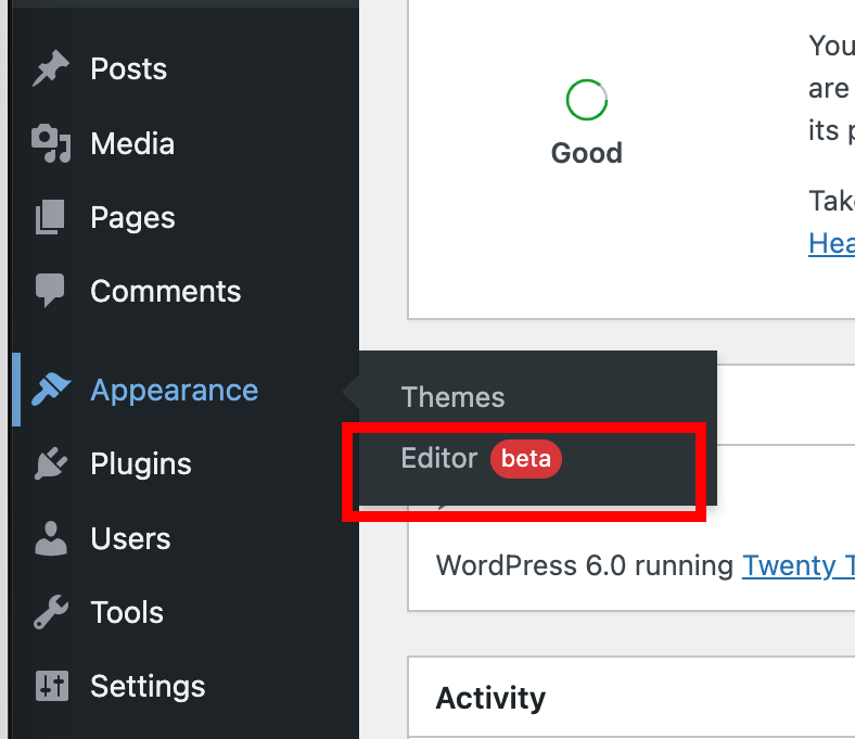
Step 1: Go to the full site editor (Appearance -> Editor).
Step 2: Select toggle the navigation menu (WordPress logo on the top left corner of the browser window) and select Template Parts.
Step 3: Create a new part template and call it two-column (yes, I know it’s a row block but you’ll see why the name fits).
You will then be taken to the editor for the part template.
Follow one of these two methods:
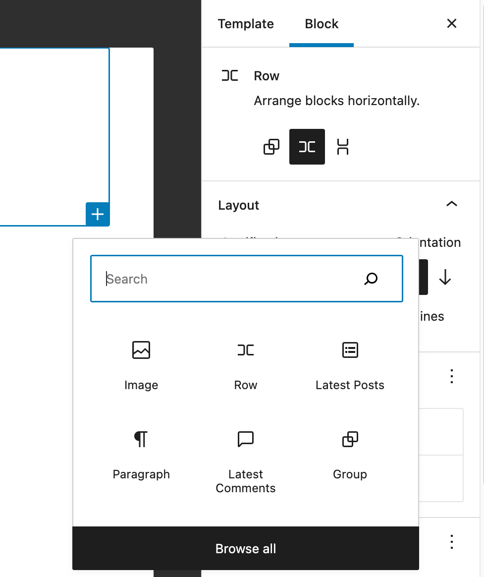
- Click on the
Add Blockbutton on the lower right corner of the editor and search forrow. - Type
/rowin the input box and then press theEnterkey.
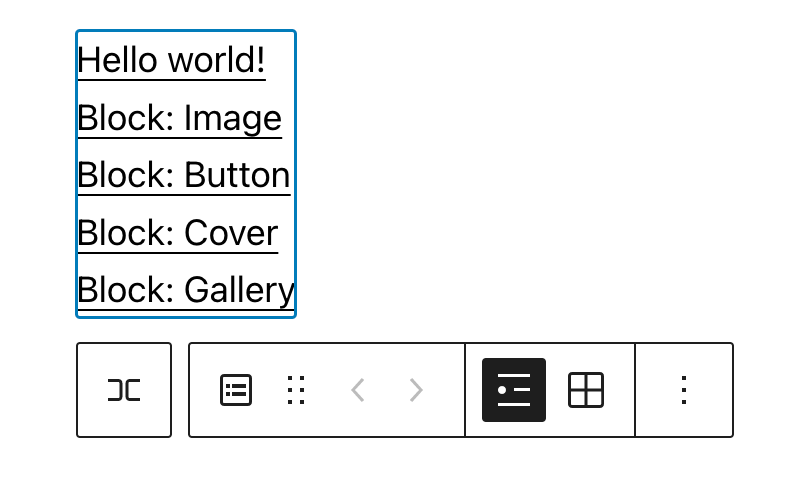
Both methods provide the same result. You will be taken to the editor block.
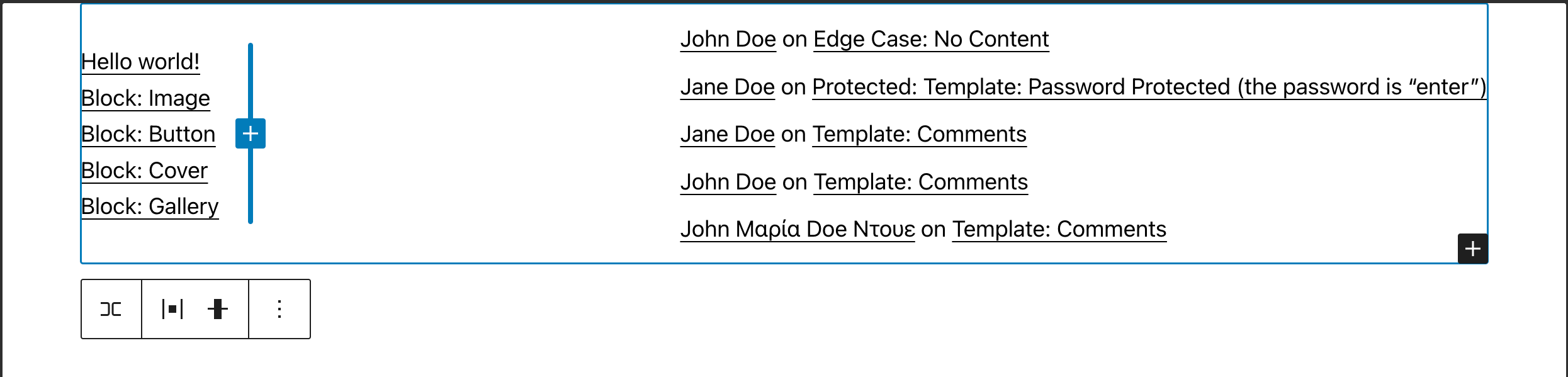
Step 4: To add content to the first box, click on the Add Block button inside the block.
Search for Latest Posts and click on it. This will display the five most recent posts in your blog.
Step 5: To add content to the second box, use the Add Block button in the lower right corner of the row block.
Search for Latest comments and press enter to insert the block
Formatting the row in the full site editor
Now that we have the blocks ready, we’ll take a step back and look at the formating of the row. We will not look at the formatting of content in the child blocks.
Step 1: Highlight the row block or go to the list view and select the row block from the list of available blocks.
You can also select the row from the list view menu by clicking on the row icon in the list of available blocks. In this example, we only have a row block available.
Step 2: Change the justification to space between and compare how the layout changes from the default align left setting.
Assessment
In CSS, Flexbox allows you to create:
- Layouts
- Images
- Typography
- Alignment
Answer: 1. Correct answer
In WordPress, you can control the layout of content using the following blocks:
- Group
- Paragraph
- Site tagline
- Row
Answer: 4. Correct answer.
To create a row with items separated by spaces, which of the following justification properties would you use?
- Justify Items Left
- Space Between Items
- Justify Items Center
- Justify Items Right
Answer: 2. Correct Answer
What does the orientation setting for the block row do?
- Controls the direction of the content (vertical or horizontal)
- Controls whether the content is displayed in reverse order
- Controls whether the text is displayed upside down
- Controls whether the text is displayed sideways
Answer: 1. Correct Answer
Additional Resources
Example Lesson
CSS provides an easy way to create one-directional layouts (columns or rows) without having to change the way you create your HTML content.
In WordPress, the row and stack blocks use Flexbox under the hood to produce similar results to what you would see with plain CSS. That’s why we’ll look at both using Flexbox in CSS and the row block to create similar results.
Before we get started
Because we’re working with CSS, we need both an HTML and a CSS file to do our work.
To prepare download the files from the repository [[FIXME: Needs repo location]] to a directory on your computer.
There are two versions of each file:
- We will use the starting version (ending with
-start) in the following exercises - It is mostly complete but it is missing the flexbox-based CSS code
- The final version (ending with
-final) is a complete version of the exercise - You can use it to compare with your work in case you get stuck
Creating row-based flexbox layouts with CSS
In this exercise, the participants will create a row-based flexbox layout using CSS.
Step 1: Open gallery-start.html in your browser. Then open gallery-start.css from the CSS folder in your text editor.
Step 2: In gallery-start.css, look at the container class, presented by the .row-layout selector.
Change the content of .row-layout so that it looks like this:
.row-layout {
  display: flex;
  flex-flow: row wrap;
  padding: .5vw;
}
Step 3: Save the file with a different name.
Explanation:
The disply: flex rule tells the browser that we want to use Flex to display the content inside this container.
flex-flow can be broken into two things: the direction of the layout flow (row or column) and whether we want to wrap the content (wrap or blank).
Delete the wrap portion of the flex-flow attribute and see how the browser behaves; then reload the HTML page in the browser.
You can replace the images with your own and see if it changes the layout in any way.
Creating column-based flexbox layouts with CSS
Open the gallery-start.html file in your browser. Then open the gallery-start.css file from the CSS folder in your text editor.
Step 1: Add the flex-related rules to the .container selector. Change the content of the .container class so it looks like this:
.container {
  display: flex;
  flex-direction: column;

  margin: 0 auto;

  height: 600px;
  width: 400px;

  border: 5px solid rgb(40,30,93);
  border-radius: .5em;
}
Explanation:
display: flex tells the browser that we want to use Flexbox to layout the elements inside the container.
flex-direction is the direction of the layout flow, in this case indicating column (a vertical layout).
Because we’re not wrapping the content we use this attribute instead of flex-flow like we did in the row exercise.
Step 2: Change the .content selector so it looks like this:
.content {
  flex: 1 1 auto;
  padding: 10px;
}
Step 3: Once you have made both changes, save the file with a different name.
flex is shorthand for three related attributes:
flex-grow: This defines the ability for a flex item to grow if necessary. It accepts a unitless value that serves as a proportion. It dictates what amount of the available space inside the flex container the item should take up- If all items have flex-grow set to 1, the remaining space in the container will be distributed equally to all children
- If one of the children has a value of 2, that child would take up twice as much of the space as either one of the others (or it will try, at least)
flex-shrink: This defines the ability for a flex item to shrink if necessary.flex-basis: This defines the default size of an element before the remaining space is distributed- It can be a length (e.g. 20%, 5rem, etc.) or a keyword
- The auto keyword means “look at my width or height property”
Play with different values in the content flex rule and see how the layout changes.
Creating row-based layouts in WordPress
This exercise will build a two-column layout using the row block.
Row and stack layouts in the full site editor use flexbox under the hood so, now that we know how flexbox works, we’ll look at creating rows and stacks/columns in WordPress.
Step 1: Go to the full site editor (Appearance -> Editor).
Step 2: Click/Tap the navigation menu (WordPress logo on the top left corner of the browser window) and select Template Parts.


Step 3: Create a new part template and call it two-column (yes, I know it’s a row block but you’ll see why the name fits).

You will then be taken to the editor for the part template.

Step 4: Click on the Add Block button in the lower right corner of the editor and search for row.

Another way to add a block is to type /row in the input box and then press the Enter key.

Both methods provide the same result. You will be taken to the editor block.
How we add content to the first box in the row is different than how we add content to the second and subsequent boxes.
Step 5: To add content to the first box, click on the Add Block button inside the block.

Search for Latest Posts and click on it. This will display the five most recent posts in your blog.
Step 6: To add content to the second and subsequent boxes, use the Add Block button in the lower right corner of the row block.

Search for Latest comments and press enter to insert the block
This is where we are at before we format the content.

Formatting the row
Now that we have the blocks ready, we’ll take a step back and look at the formating of the row. We will not look at the formatting of content in the child blocks.
Step 1: Highlight the row block or go to list view and select the row block from the list of available blocks.
You can also select the row from the list view menu by clicking on the row icon in the list of available blocks. In this example, we only have a row block available.

Step 2: The block settings present us with a list of options that we will discuss in the next sections:
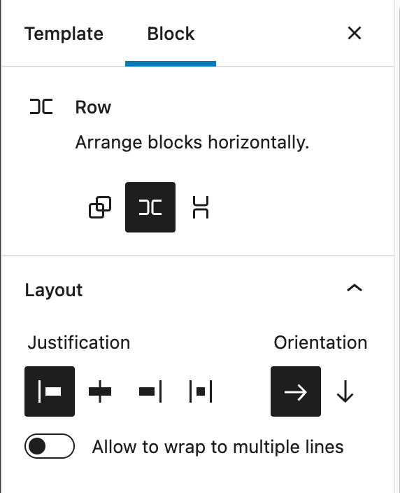
The first set of options is the type of layout we want.
Group: The icon on the left side. A generic container
Row: The icon in the center. Horizontal flexbox layout

Stack: The icon on the right. Vertical flexbox layout

The justification settings allow you to control how are the items distributed in the row. From left to right, the values are:
- Left justified: All items are left-aligned
- Centered: All items are centered
- Right Justified: All items are right-aligned
- Space between items: Items are evenly distributed in the line

Group Discussion
- What happens if we change the justification to space between?
- How does it compare to the default
align leftsetting? - What would you use these settings for?
The orientation setting controls the way the items are laid out in the row. The two possible values are:
- Horizontal (the default): Items are laid out horizontally
- Vertical: Items are laid out vertically
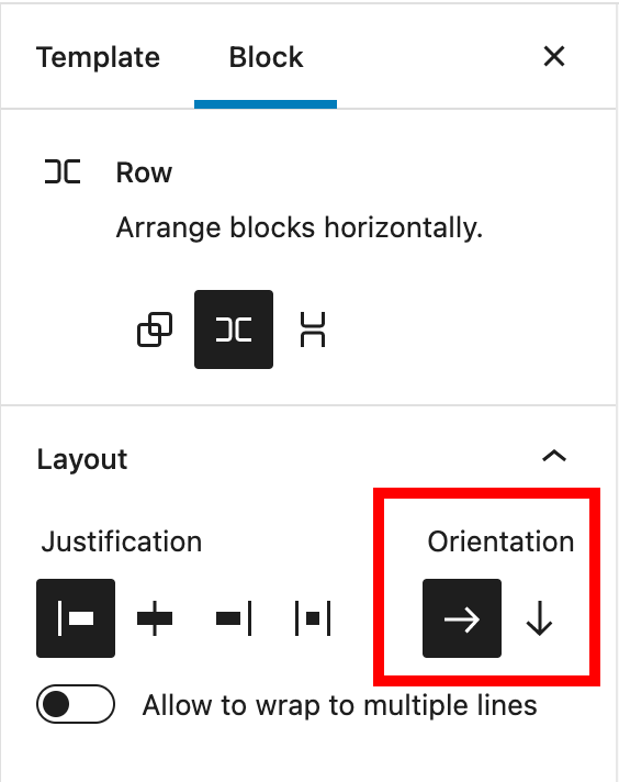
Group Discussion
- When would a vertical layout work best?
- What is the difference between a stack layout and using vertical orientation?
The final setting is a toggle button that will control if the content will wrap around the row.
If you enable the toggle (by moving it to the right), elements will wrap around to the next line.
Toggle the wrap setting to wrap items around the row and compare how the layout changes.
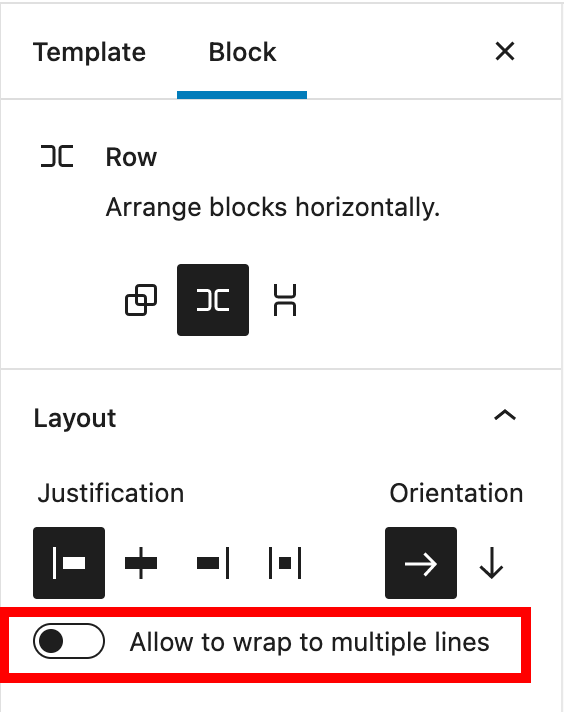
Group Discussion
- Undeer what circumstances would you allow the block to wrap to multiple lines?
Lesson Wrap Up
Follow with the Exercises and Assessment outlined above.