Best Practices When Capturing Images
High-quality screenshot images and screencast videos can help visitors quickly learn the details they are seeking. Capturing great details can take a bit of thoughtfulness for accessibility and consistency.
Objectives
After completing this lesson, participants will be able to:
- Explain which elements of a screenshot are important for readability and accessibility
- Differentiate between effective and ineffective screenshots
- Create screenshots that are effective and accessible for all viewers
Prerequisite Skills
Participants will get the most from this lesson if they have familiarity with:
- Screencast software
- Screenshot software
- WordPress user experience
Readiness Questions
- Are you creating screenshots, gifs, or videos for training material?
- Do you create docs, knowledgebase, or other tranining materials?
Materials Needed
- A WordPress sandbox site with approved demo content (Theme Test Data and default themes)
- Subject-specific additional needs, such as VS Code
- Computer
Notes for the Presenter
- All computers have built in capability for this, including mobile devices.
- Participants may opt for paid tools, but have a variety of options without paying.
Lesson Outline
- Show what not to do
- Then review better options
- Finish discuss what was good or bad about either
Exercises
Exercise name
Capture several screenshots and videos to share with other attendees
- WordPress Admin Dashboard > Settings > General
- Posts > All Posts
Present your screenshots to others to view the perspective others used and discuss what you like about their approach.
Assessment
Cropping refers to framing an image
- True
- False
Answer: 1. True
Cropping refers to framing an image
- True
- False
Answer: 1. True
Additional text over images is recommended
- True
- False
Answer: 2. False, this can be troublesome for translation purposes
Zooming in can help focus the viewer
- True
- False
Answer: 1. True
Example Lesson
Screenshot images can enhance visitors’ comprehension. Thoughtful planning and positioning can help.
Computers have a built-in method for taking screenshots. See the exact directions for
- OS X (and Annotiating Images in Preview)
- Windows (and Annotating)
- Linux
If you would like to use a tool to add annotation, here are a few available options:
Depth of Field
Website browsers often include a method to zoom in or out on the content. This can be a helpful way to show exactly what you want. Use this with restraint to also keep in mind if this benefits viewers.
Too Far Out
When the focal point is too distant, users may have a hard time focusing on the area you intend. The text may also be too small to read.

Too Close In
Zooming in closer may seem like a great idea, but should also be used cautiously. In zooming closer, we don’t want to lose the context of where we are in the navigation or full window display.
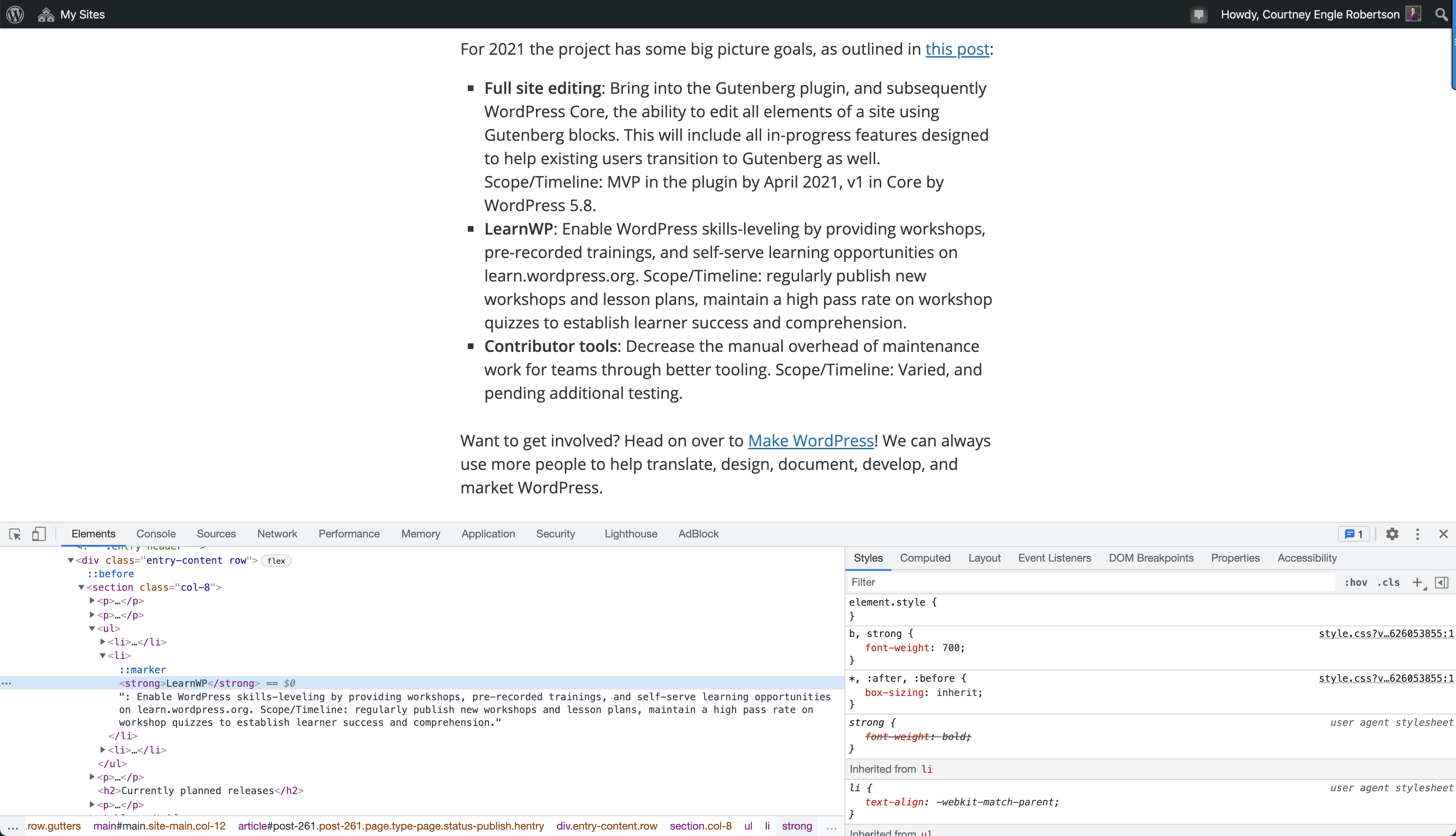
Zooming in to Developer Tools
Compare the default zoom level for browser content and developer tools:

Cropped oddly
Cropping means setting the boundaries of the image. We want to avoid chopping elements oddly. In the image below, the Help tab does not fully display and the Site Language icon and boundary of the drop menu are chopped off.

Look for any text that appears to continue off the screen as well.
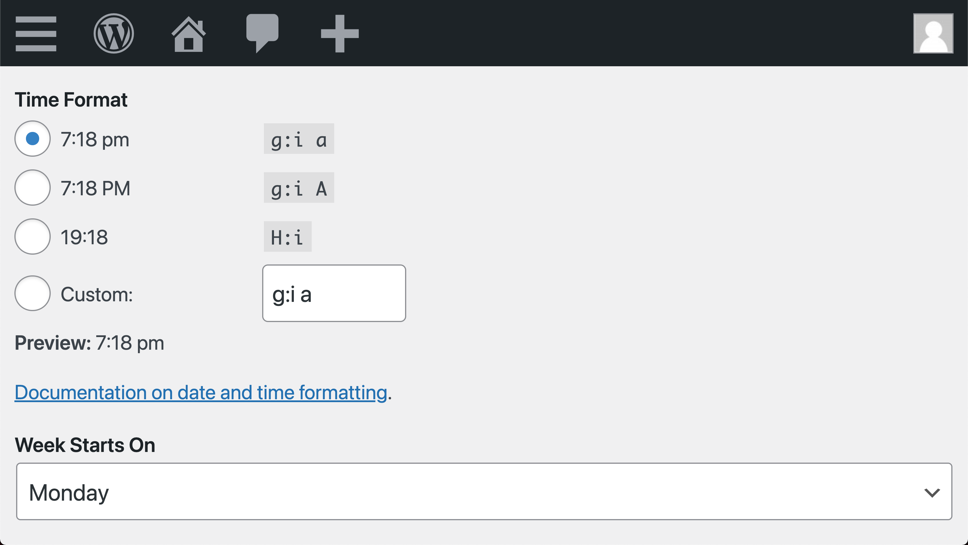
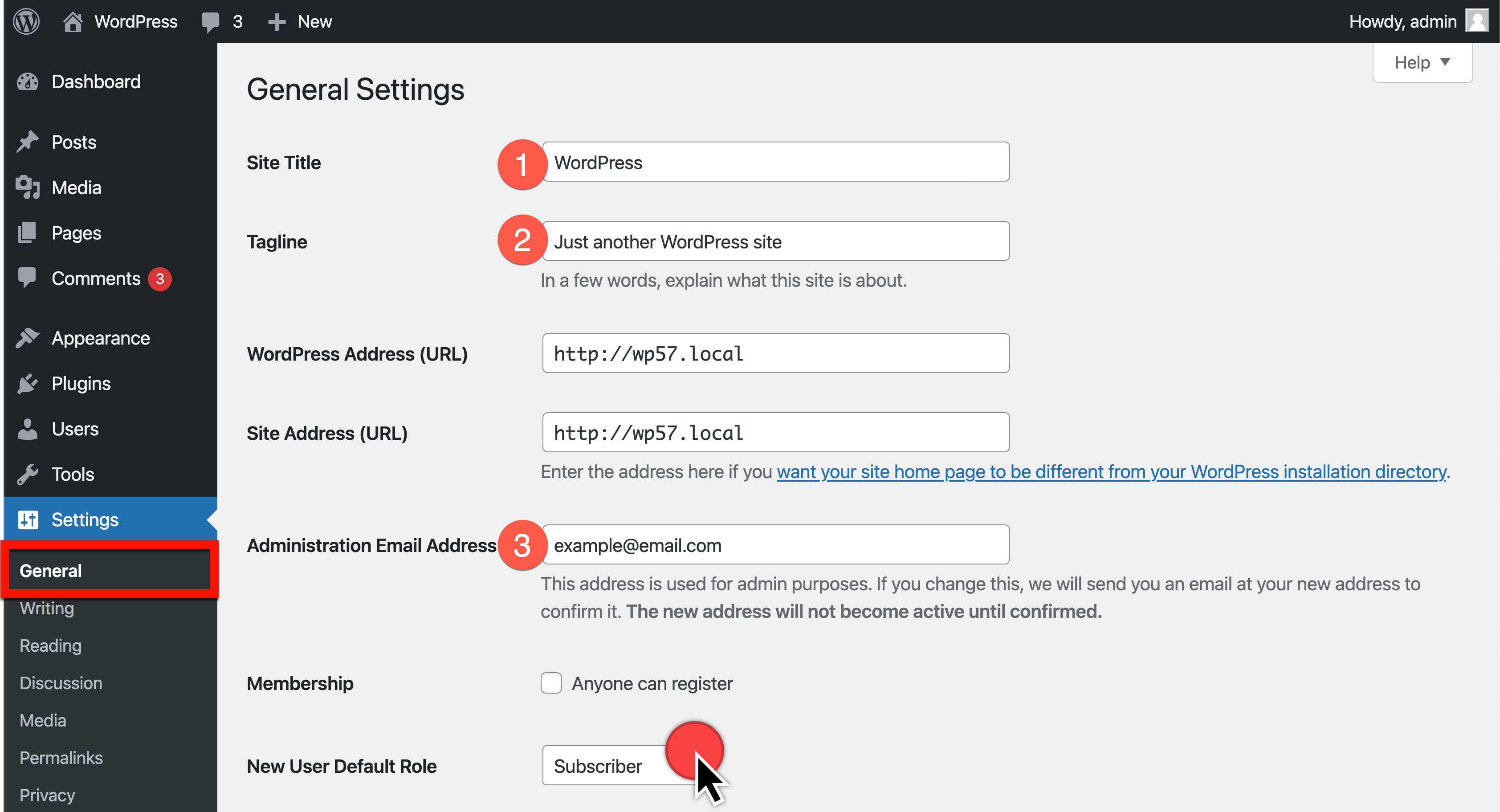
Well Sized Screenshot
Annotation Design
Adding additional callouts to images can help draw the visitor’s eye to the exact steps or actions you would like them to take.
We avoid adding additional text over images, as this can be a translation challenge.
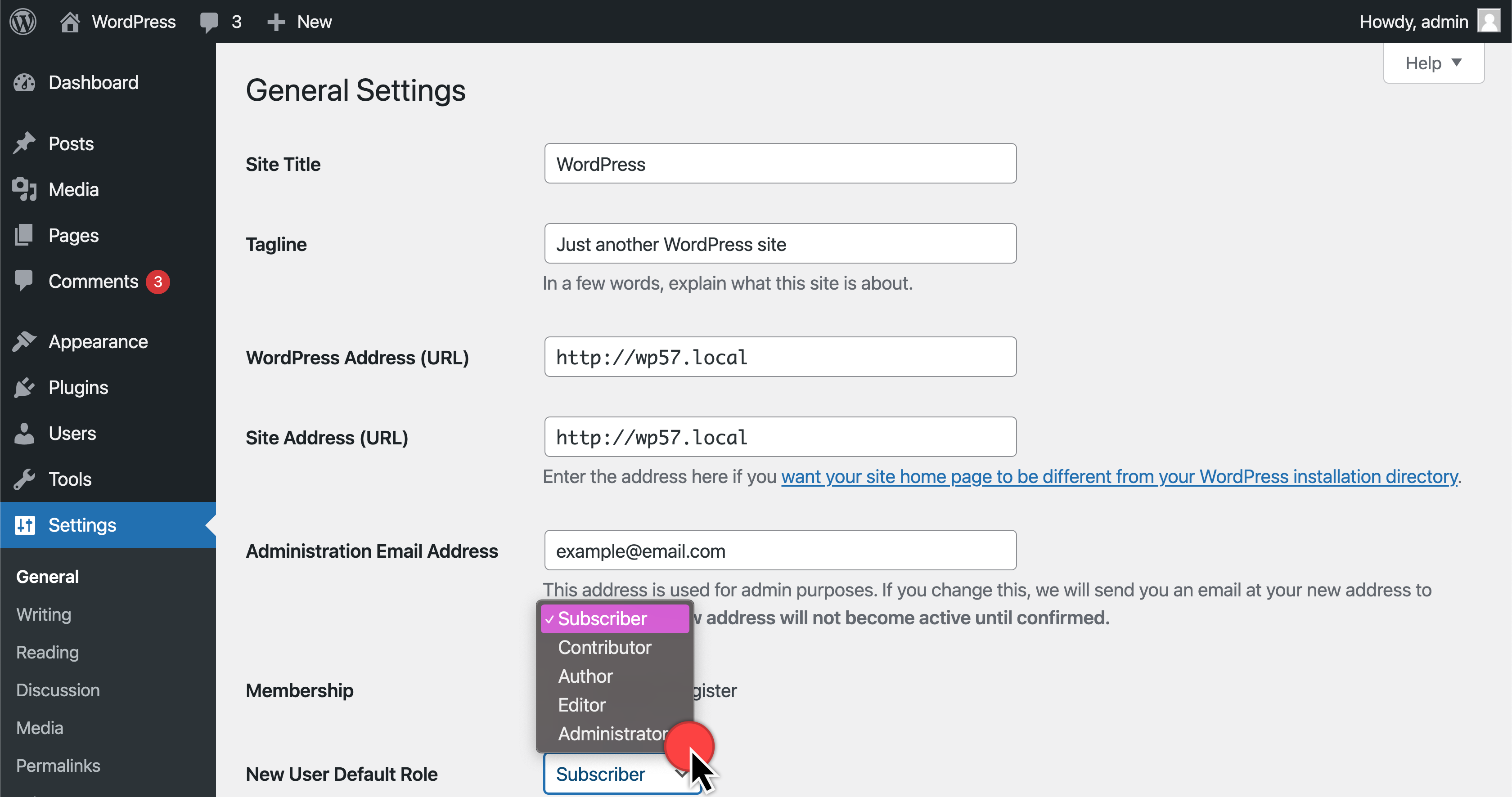
Difficult to Read
In the image below, the grey icon markers are a challenge for accessibility contrast needs. While the placement of the annotation is good, the contrast is not.
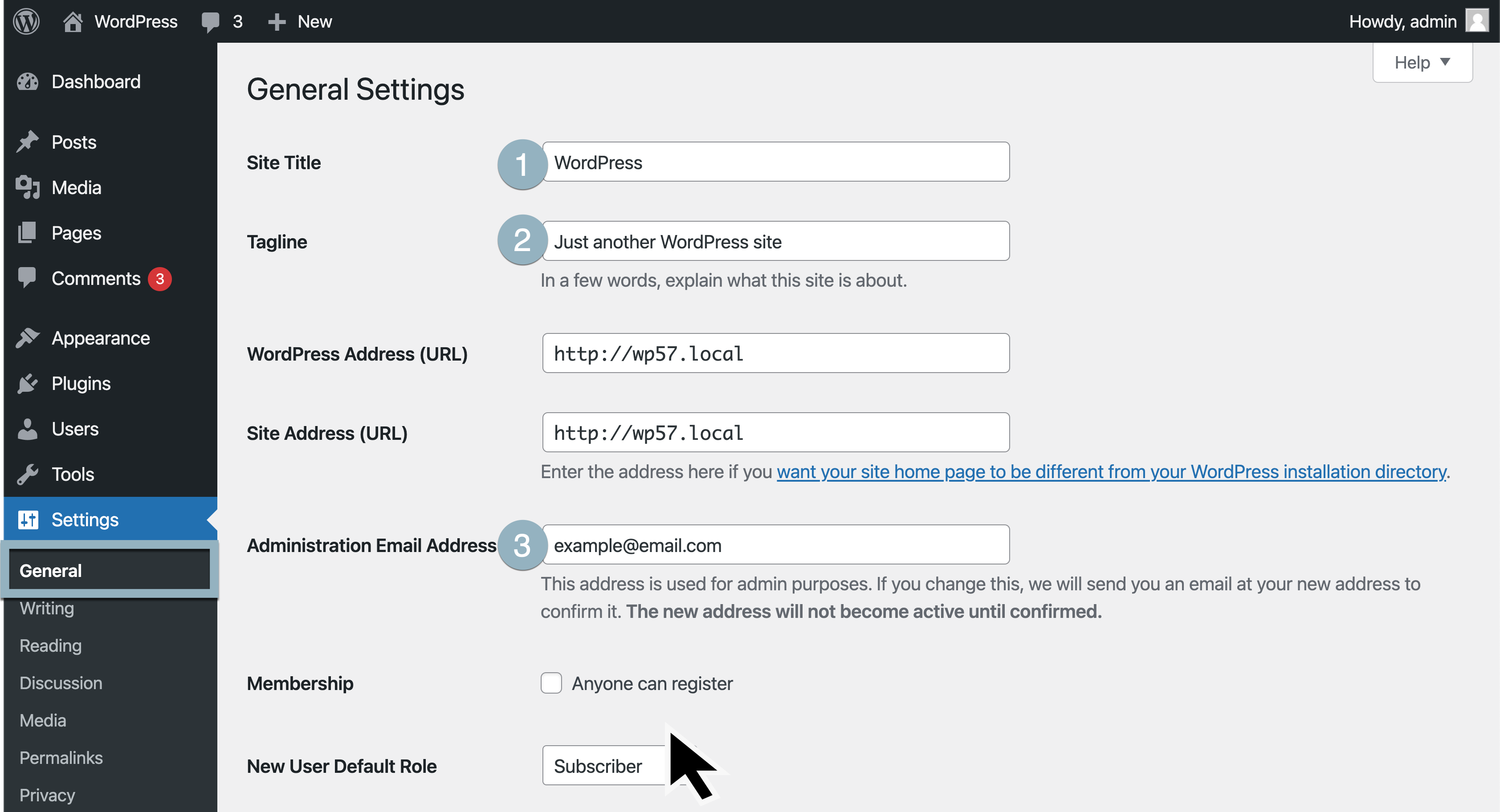
Easier to Read
In this image, the contrast is strong and consistent. The color stands out well against the background.
Additional Formatting
- Always use ALT text to describe images for accessibility considerations
- Use Captions when appropriate
- Include written text between a series of vertical images
- Provide useful names to the image files. Bad: image1234.jpg Good: my-descriptive-title.jpg
- Use high-resolution images in .jpg or .png format
Anonymizing Information
- Keep any names generic. This is not a place to include your business name, personal email address, or other sensitive data.
- Use the Theme Unit Test Data and/or Gutenberg Test Data to create demonstration content on the site.
- For other demo data, check out FakerPress.
- For general image placeholders, PlaceKitten works well.
Video Extension
The same principles for framing the area to capture apply as well to video screencasting. With screencasting, also consider the speed at which transitions occur and minimal but effective time between spoken words.